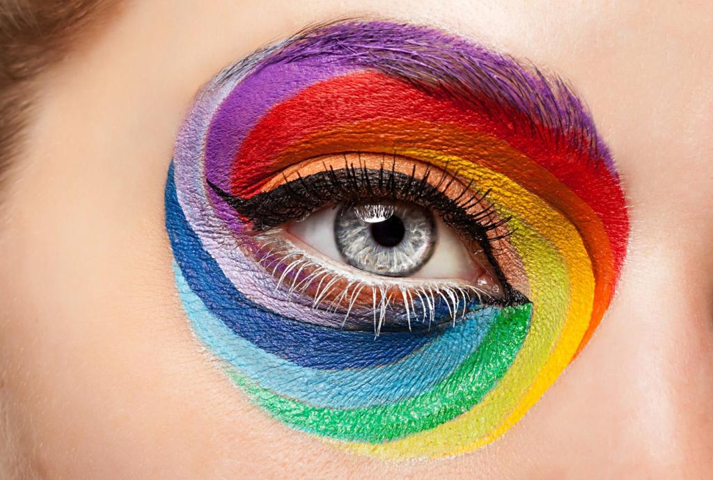
The Many Faces of Contrast
Value contrast is the fastest way to create emphasis and readability. A bright subject against a deep field becomes irresistible. Practice by converting your design to grayscale first, then adjust values until your focal point pops. Tell us what changed once you tuned the lights and darks.
The Many Faces of Contrast
Warm colors advance and feel inviting; cool colors recede and feel spacious. Blend them thoughtfully and your layout breathes. A warm call-to-action set against a cool backdrop can feel like a friendly doorway. Share a screenshot where temperature contrast clarified purpose without shouting.