A Guide to the Psychology of Color in Design

Today’s chosen theme: A Guide to the Psychology of Color in Design. Step into a palette of meaning where hues carry emotions, memories, and choices. Explore how color steers attention, builds trust, and tells richer stories. Share your palette wins and subscribe for deeper color insights.

Why Color Shapes What We Feel

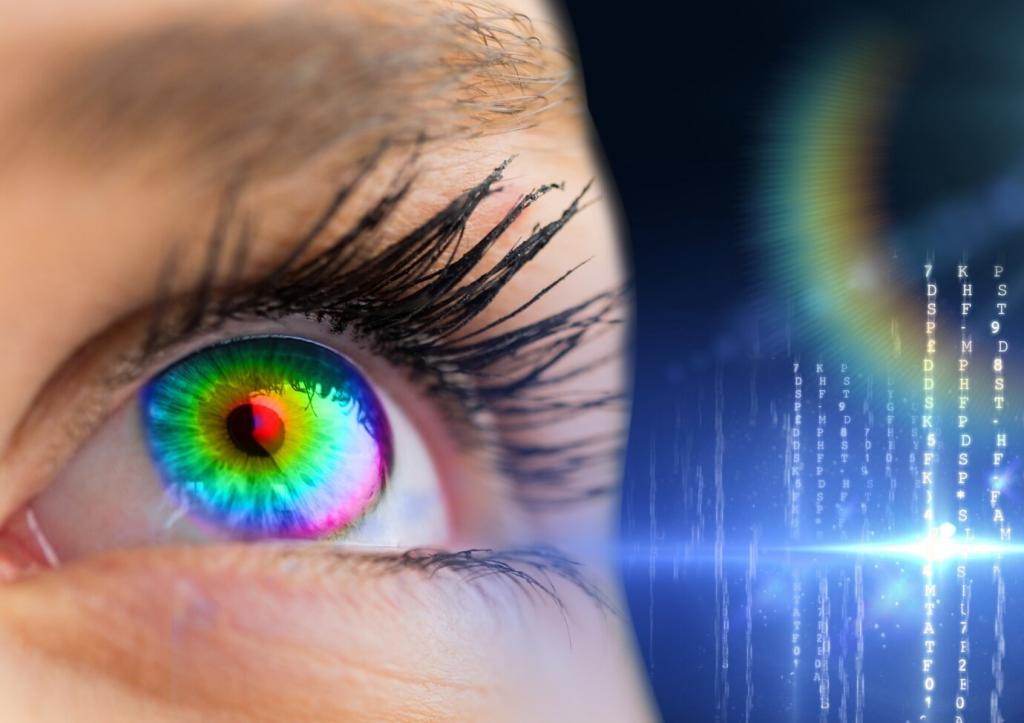
Cones in the retina translate wavelengths into nerve signals, routed through the thalamus and into emotional centers like the amygdala. That is why a sudden red alert spikes arousal. Have you noticed how muted blues slow your breathing during long reading sessions?

Why Color Shapes What We Feel

Red can signal luck in China and danger in many Western interfaces; white reads as purity in weddings and mourning in different traditions. Context reframes meaning. What colors in your interface have sparked unexpected reactions across regions or communities?

Building a Color Strategy for Your Brand

List three feelings your brand must evoke, such as calm, competence, and warmth. Map each emotion to hues and temperatures. The psychology of color in design works best when it supports a narrative, not when it chases trends without intent.

Building a Color Strategy for Your Brand

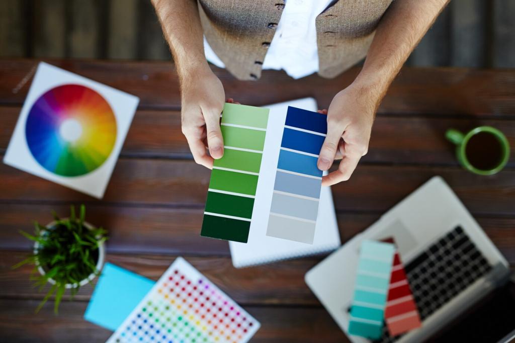
Establish roles: primary brand color for recognition, secondary tones for flexibility, neutrals for balance, and an accent to guide action. Set naming, tokens, and usage notes. Share your palette draft with us to get feedback from fellow color enthusiasts.

Practical Palette Systems and Craft

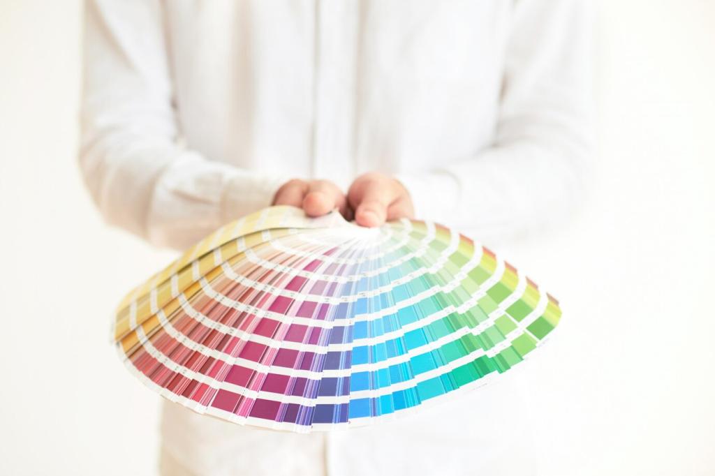
Warm colors often energize, cool tones reassure, and neutrals create breathing room. Pairing a cool primary with a warm accent can create balanced tension. Try sketching three combinations and share your favorite in the comments to spark community critique.

Practical Palette Systems and Craft

High contrast improves legibility and confidence, while low contrast feels gentle but risky for accessibility. Use contrast ratios as guardrails, not jail cells. The psychology of color in design thrives when legibility and emotion harmonize, never when one overwhelms the other.

Color in UI and UX Behavior

Guiding Attention Without Shouting

Reserve your most saturated accent for the single primary action per screen. Support it with spacing, size, and microcopy. When everything screams, nothing speaks. Which screen in your product could benefit from a calmer, smarter color hierarchy today?

Color for Feedback and States

Success greens, warning ambers, and error reds are familiar, but consider nuance: softer reds for fixable issues, stronger reds for critical failures. Pair color with icons and text for redundancy. Share your favorite state design pattern below.

Dark Mode Realities

In dark environments, bright hues bloom and shift perceived contrast. Slightly desaturate accents and lighten surfaces to balance glare. Test photos and charts too. If you have a dark mode story—wins or pitfalls—drop it for readers learning this craft.

Accessibility and the Ethics of Color

Designing Beyond Perfect Vision

Simulate deuteranopia, protanopia, and tritanopia to ensure critical information remains clear. Use patterns, labels, and iconography alongside color. Accessibility is not a constraint—it expands your audience and deepens trust in your visual language.

Inclusive Documentation and Tokens

Write guidance like “Use Success 600 for positive confirmations.” Store tokens with semantic names. Explain why certain contrasts exist to prevent erosion over time. Share your token naming approach so others can refine their systems with empathy.

Ethical Uses of Urgent Red

Reserve alarming reds for genuine risk. Manipulative color erodes credibility, even when it boosts short-term conversions. The most persuasive color is the one aligned with truthful intent. How do you balance urgency and honesty in your designs?

Testing, Iteration, and Team Alignment

Set hypotheses like “A calmer blue accent will improve completion without reducing visibility.” Capture qualitative reactions and quantitative outcomes. Share your experiment plan in the comments, and we will feature thoughtful studies in a future roundup.
Orcanode
Privacy Overview

This website uses cookies so that we can provide you with the best user experience possible. Cookie information is stored in your browser and performs functions such as recognising you when you return to our website and helping our team to understand which sections of the website you find most interesting and useful.