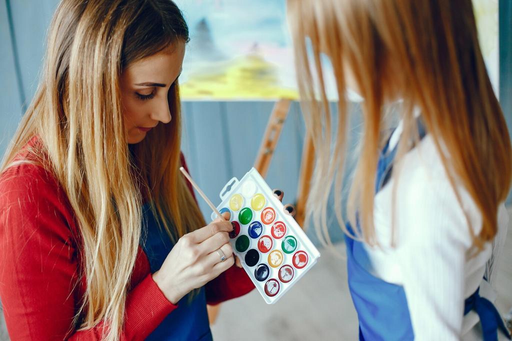
Seeing Art Anew: The Impact of Color Perception on Art
Chosen theme: The Impact of Color Perception on Art. Explore how light, biology, memory, and culture reshape every pigment on the canvas—and why two viewers rarely see the same painting. Join the conversation, subscribe for fresh insights, and share how color has surprised your eye.
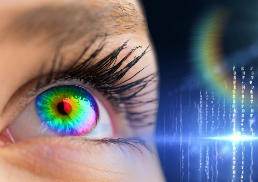
Cones, Rods, and the Brain’s Color Calculus
Three types of cones sample wavelengths, but your brain interprets them through opponent processes, balancing reds with greens and blues with yellows. This neural math explains afterimages, makes grays glow, and lets artists suggest brilliance without pure pigment.
Context: Why the Same Hue Feels Different
Place one mid-gray on white, then on charcoal, and watch it tilt warmer or cooler. Surroundings, edges, and light temperature reframe a hue’s identity, giving painters a toolkit to modulate mood without changing the paint itself.
Try the Sidewalk Test
Hold a color swatch against different storefront windows at dusk. Notice how glass tint, interior lighting, and street reflections warp its character. Share your observations in the comments and tell us which pairing shocked you most.
Medieval Light and Symbolic Hues
Gothic painters used ultramarine for Mary not only for prestige, but to signal heavenly light. Viewers were primed to feel blue as sacred, proving perception is never just retinal—it is braided with narrative and devotion.
Monet painted shadows in violets, not black, after noticing how atmosphere cools color. By chasing flicker, he taught us that momentary light remixes pigment on the eye, making optical blending feel more luminous than any mixed palette.
Palette and Emotion: Why Hues Change How Art Feels
Warm vs. Cool Emotional Arcs
A warm, high-chroma foreground can feel urgent, intimate, and close, while cool, desaturated distances breathe calm and longing. In portraiture, nudging skin tones cooler shifts introspection; tipping them warmer invites presence and connection.
Red may thrill in one context yet warn in another, and childhood rooms tint our preferences for life. When you encounter a painting, your biography shades the hue, proving perception is personal, layered, and evolving.
Standing before a Rothko, a child whispered, “It’s humming.” As the gallery lights dimmed slightly, the reds deepened into a quiet chorus. Perception shifted with illumination—proof that environment steers emotion without the canvas changing.
Place a neutral gray beside a saturated orange, and the gray will appear bluish by comparison. Artists use this to cool highlights or warm shadows without altering formulas, letting neighboring colors do the psychological heavy lifting.
Munsell’s hue–value–chroma model helps isolate brightness from intensity, while CIELAB approximates perceptual distance. Using both clarifies why two colors may measure similar yet feel different when value contrast or adjacency changes.
Screens, Prints, and White Balance
A painting shot under warm bulbs can skew orange, then cool on a calibrated monitor. Understanding white balance, ICC profiles, and viewing booths protects the artist’s intent as color travels from studio to screen.
Pigments, Lightfastness, and Reality Checks
Not all hues age equally. Learn the permanence of favorite pigments and how varnish and ambient light shift appearances over time. Share your conservation wins and mishaps so others can preserve their palettes wisely.
Studio Anecdotes: When Color Teaches the Artist
01
I once chased a sky too green because phthalo over titanium white fooled my eye. A gentle violet glaze neutralized it instantly, proving that subtle complements can calm chroma without muddying the atmosphere.
02
A wall painted cheerful yellow dulled under evening streetlights. Adding a cooler, lighter trim nearby restored the perceived brightness by contrast. It felt like turning up a dimmer switch without changing the pigment.
03
In critique, a friend suggested warming a shadow edge instead of darkening it. The form rounded beautifully, reminding me that temperature can describe space more persuasively than sheer value shifts.
Your Turn: Practical Experiments in Color Perception
Albers-Inspired Squares
Create two small studies where the same middle square looks different by changing only the surrounding color. Post photos, note your palette, and describe the perceived shift—cooler, warmer, closer, farther.
Pocket Palette Journal
On walks, swatch sky, brick, leaf, and shadow under varied weather. Write what you expected versus what appeared. You’ll train anticipation, not guesswork, and we’d love to hear your weekly discoveries.
Photographing with Intent
Shoot one painting under daylight, warm lamps, and a window with green trees outside. Compare files on a calibrated screen and share which lighting honored your palette. Subscribe for upcoming guides on taming color online.